Abstract
As part of the requirements phase of the Toyota Financial Services finance portal project an existing portal interface, based on a website using production code, was tested in line with the guidelines published in ISO 92411 (ISO, 1998).
Qualitative and quantitative methods were used in a two-stage evaluation. Qualitative data was obtained using verbal protocol analysis – this method is a think-aloud technique of eliciting cognitive and physical process descriptions from a user through verbalisation of their actions. The use of eye-tracking facilitated the use of ’retrospective’ verbal protocol analysis in the form of the retrospective think aloud protocol, meaning that users could use the site in the first instance, and then communicate their rationale and intention when shown a recording, including gaze plot data, of their actions. In comparison to the more commonly used ’concurrent think aloud protocol’ this method results in a reduced cognitive load on the user and a more realistic interaction with the website. Figure 1 shows two heat maps illustrating the saccadic and focal differences in analysis patterns for retrospective v current think aloud protocols for a Google search results page. As can be seen, using the retrospective think aloud protocol shown on the right results in the user being able to dedicate more of their focus on the task at hand and to scan further down the search results page as they are not dedicating part of their cognitive focus to describing their actions whilst taking them.
Additionally quantitative data was obtained from 10 users using a 5-point Likert scale based on the System Usability Scale methodology for user interface evaluations (Brooke, J., 1996). which was subject to statistical analysis to assess the effectiveness, efficiency, and satisfaction of the system. Hypotheses and benchmark criteria was created according to published guidelines so that the system could be evaluated on a pass/fail basis.
Production code was used for the testing so that response times and com- ponent behaviours were realistic. The system demonstrated effectiveness in numerous areas, though some elements did not behave quite as anticipated, ei- ther being ignored or not fully understood, although it should be noted that none of these problems were severe and did not prevent users from completing
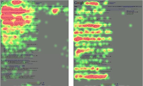
Figure 1: Concurrent Think Aloud Protocol v Retrospective Think Aloud Protocol
the task scenario. Split-run testing was undertaken for a particular page of the website (the ’Purchase Plan Review’ page) and strong support for our hypothe- ses was found in analysis of the eye-tracking data, identifying the version with non-collapsible data as preferable for the Norwegian market.
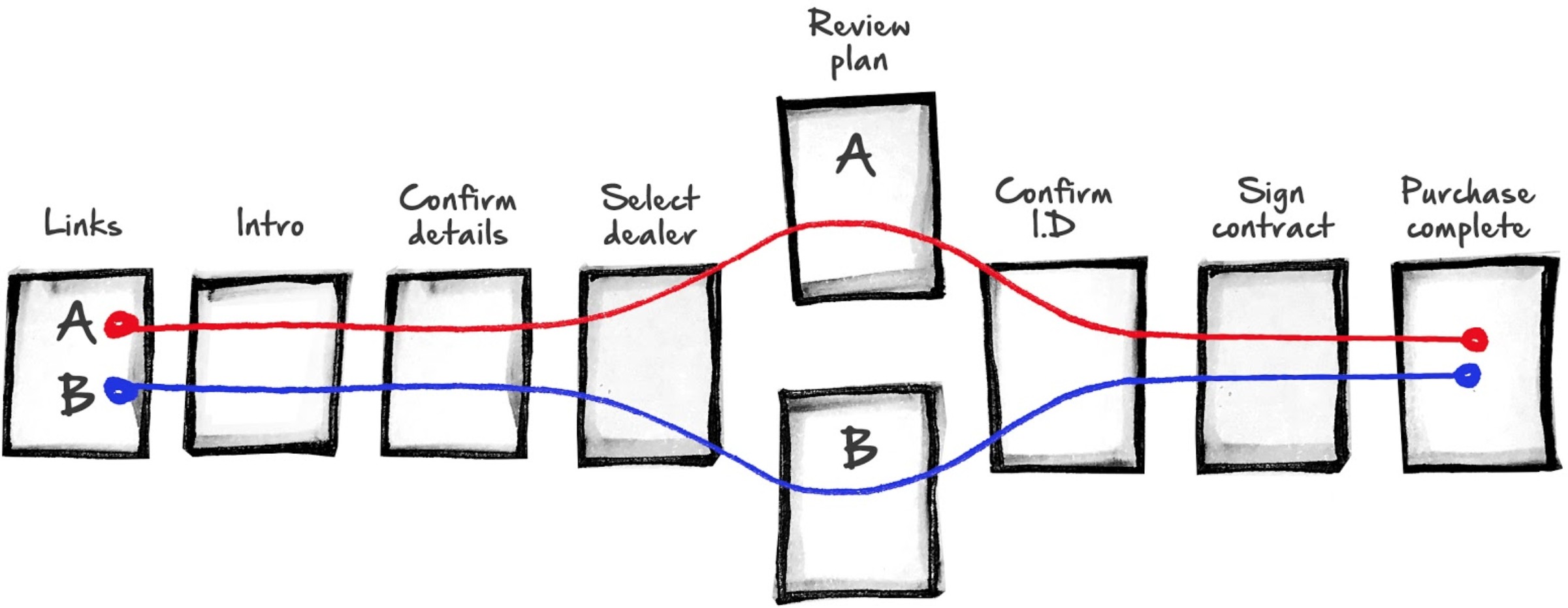
Figure 2: Split-run test divergence diagram (Malcolm Seaborn) Recommendations for potential usability improvements included removal of collapsed data for the Norwegian market, and future iterations of usability and utility testing were suggested.
The Project
Valtech is developing an Internet-based finance servicing portal for Toyota to serve the needs of their car purchasers who currently have to use a distributed range of networked systems and services to access car finance.
The objective behind the project is to create a single website which will offer tailored finance solutions customised to suit the needs of individual users.
The project represents a substantial investment by Toyota and it is therefore essential that a considered and systematic approach is undertaken during all stages of the portal’s development.
At present, the project is focusing on the requirements setting phase of a user-centred design process, adhering to ISO 13407 (ISO, 1999; Earthy et al, 2001). Using ISO 13407 as a guide efforts have thus far concentrated on the following:
- Understanding and specifying the context of system use.
- Identifying users and stakeholders.
- Identifying user goals and tasks.
- Producing design ideas and concepts.
The Website
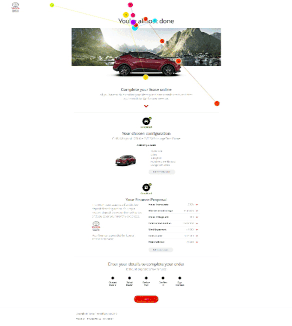
Users are presented with a set of pages, which take them through the steps of arranging finance for a car they have chosen and configured on the Toyota website.
There is a business case for implementing a new finance section as it is be- lieved that the predicted long-term usability gains offset the initial expenditure. That said, the expected return on investment depends on the provision of effort- less access to car financing services, so if the website is difficult to use the project will fail as users may potentially revert to the websites of other car manufactur- ers. Thus a successful website should be transparent as users are encouraged to work through, rather than with, the website. In viewing the website as a means rather than an end, this evaluation draws parallels with activity theory (Nordi, 1996; Bedny Meister, 1997) and the system will be judged by the ease with which users accomplish predetermined goals.
The Evaluation
Evaluating user interfaces is increasingly important as systems become ever more sophisticated and are designed to support highly complex tasks. Indi- viduals need to understand how to work with an interface in order to satisfy their goals (Norman, 1986), and with fierce competition between products it is essential that software is usable (Travis, 2003).
Researchers and practitioners in the fields of human-computer interaction (HCI), software engineering, and human factors seek to understand what makes computer software easy to use (Nielsen Mack, 1994; Adler, Winograd and Bruce, 1996; Blandford Green, 1997).
There are a wide range of methods to evaluate the usability of a system and a great many published guides provide instruction in their use (Nielsen, 1993; Rubin, 1994; Faulkner, 2000; Kirakowski, 2000). For the purposes of this evaluation usability is defined as the “extent to which a product can be used by specified users to achieve specified goals with effectiveness, efficiency and satisfaction in a specified context of use’ (ISO 9241-11, 1998 p2). Therefore, this usability inspection aims to apply a range of techniques to uncover areas of the website that are potential barriers to effective, efficient, and satisfactory use.
Although the research methods to assess usability and utility are similar, an evaluation of website utility falls outside of the present terms of reference. It is assumed that in reaching this stage of the design process, Valtech will have established that a website will provide greater user support than the finance processes currently in place.
Test Objectives
Qualitative evaluations using published heuristics (e.g. Schneiderman, 1998; Preece et al, 2002) will be used to discover some of the main usability issues before narrowing the focus to a more quantitative analysis. Through the sys- tematic collection and interpretation of effectiveness, efficiency, and satisfaction data the ease with which users are able to satisfy specified goals will be eval- uated. The system will be judged according to the following pass/fail criteria, with satisfaction to be rated at 90 percent or above using a five point Likert scale for:
- Screen clarity.
- Screen layout.
- Learnability.
- Navigation.
- Usefulness.
Specified task completion ratios:
- with 90 percent completeness by 100 percent of users (effectiveness).
- within a specified timeframe by 90 percent of users (efficiency).
- with lostness scores below 0.50 i.e. efficiency ¿ 50 percent.
- with efficiency scores below 0.50 i.e. inefficiency ¡ 50 percent.
The broad aim of the evaluation presented herein is to identify usability issues to inform the website design process through objective, observable, data.
Method
Participants
Users were comprised of an agency-selected sample, facilitated through an agency in Norway named ‘Pollstat’, based on criteria provided by Valtech. To maximise sample size incentives were offered to participants by Pollstat, and an inclusive acceptance criteria was used. The initial selection process was restricted to Nor- wegians with a conversational level of English and proficiency with a mouse and keyboard. Specifically, it was mandated that all participants be able to speak, read, and write in English (CEFR level C1 or C2 i.e. advanced to proficient). The age range was set at 25-50 years old, and experience as an online shop- per spending at least 500-2000NOK (approximately 50-200GBP) online each month was neccesary. Particpants were also required to drive at least once and week and not work in the fields of design, UX, product development, marketing, psychology, or any related field.
This initial screening criteria was in place to ensure that the participants’ performance would not be confounded by a poor comprehension of the interface and task instructions, or an inability to use the standard computing equipment. Further demographic data was collected using a questionnaire to ensure that the participants were representative of the car purchasing population. Informed consent was solicited and all participants were treated according to ethical guide- lines (BPS, 1993).
Context of Evaluation
It is known that products have variable levels of usability when used under different conditions (ISO 9241-11, 1998), so to maximise the validity of the study, the context of evaluation is described below. Any known deviations from the expected context of use are stated.
Product under Test
The product under test was the Toyota Financial Services finance website which has been customised and implemented by Valtech Limited (https://www.valtech.co.uk ;Valtech website, 2017). A live server hosted by Amazon Web Services was used so participants could interact with the actual system rather than a prototype. Some elements such as post-fulfillment emails were simulated, but all other as- pects of the website were using full production code on a live server.
Test Facility
The user trials were conducted on site in Norway under controlled conditions. Although the sessions only lasted for approximately 60 minutes, ergonomic stan- dards were observed with regard to the participants’ use of the facilities (ISO 9241-5:1998; ISO 9241-6:1999; ISO 11226:2000). The testing was conducted using a laptop PC with an Intel i7 processor running Microsoft Windows 7 with a built-in LCD panel (17 inch, resolution 1400×600, 60Hz refresh rate, 32bit true colour).
The input devices used were a standard UK keyboard and mouse, and the computer was connected to the Internet through a wireless local area network connection using Internet Explorer (version 10.0) and Chrome (64.0.3282.167). An adjacent observation screen, was used to monitor the user trials. A live feed from the participant’s computer was captured using an external video capture card (Elgato HD 60S), and recorded using both Tobii Studio (on the main usability testing machine as well as being both streamed and recorded to YouTube via a second, high spec laptop which consumed and broadcasted the feed from the video capture card. The spec of this laptop included the latest i7 Kaby lake processor, 16GB RAM, and an Nvidia GTX 1050 graphics card.
Design Rationale
To provide qualitative and quantitative evaluations the study was conducted in three phases. The first phase was designed as a formative evaluation, moderated by a usability researcher and observed in person by a designer, for general usability issues and to discover which elements of the system could be evaluated at a finer level of abstraction during subsequent user trials. The recruitment for this initial study was undertaken ad-hoc using a ‘hallway intercept’ (‘guerilla’) method on-site at a shopping centre. The second study was undertaken using a sample recruited by a Norwegian agency (‘Pollstat’) under instruction from Valtech. The methods used in these two initial studies were verbal protocol analyses in the form of the concurrent think-aloud protocol.
The third phase, the phase described by this document, evaluated the perfor- mance of 10 test users using tasks that had been identified in the initial analyses. Verbal protocol data, in combination with eye-tracking data, was recorded from ten participants during a summative study that was also used to identify the preferred page structure between two page design approaches for the ’Purchase Plan Review’ page: ‘design A’ and ‘design B’.
All participants received the same tasks with the version of the ’Purchase Plan Review’ being the only variable which changed depending on participant. To control for the confounding of ordinal position, the variable page design was counterbalanced and presented to participants on a quasi-random basis. Due to the small sample size between-subjects comparisons were not made.
Usability Metrics
In addition to the qualitative evaluations of the website, a number of different methods were used to collect quantitative data under the categories of effective- ness, efficiency, and satisfaction. The three categories were supplemented by a measure of learnability, thought to be important given the expected context of use. The use of the measures of effectiveness, efficiency, and satisfaction was guided by established usability standards (ISO 9241-11:1998).
Effectiveness
Effectiveness was operationally defined as the “accuracy and completeness with which users achieve specific goals” (ISO 9241-11:1998, p2). The measures of effectiveness were expressed in terms of task completeness and the proportion of users who performed to criterion.
Efficiency
Efficiency was defined as the “resources expended in relation to the accuracy and completeness with which users achieve goals”. The measures of efficiency were expressed as the:
- Percentage of users completing task within a specified timeframe.
- Extent to which users were lost.
- Efficiency of task performance.
An expert user, specifically a Valtech consultant familiar with the site, per- formed the task six times – alternating in each counterbalance sequence (be- tween version A and B) as well as the desktop and mobile sites – providing a mean score to represent the fastest practicable completion time. The expert time was then doubled to set the criterion for efficient performance so that the percentage of users performing within this timeframe could be evaluated. To measure lostness (Smith, 1996), and efficiency, the tasks were segmented using Hierarchical Task Analysis. This enabled the minimum number of required steps – or nodes visited – to be stated for the task. By comparing this optimal route with the actual number of nodes visited, measures of lostness and efficiency could be computed.
Satisfaction
Satisfaction was defined as ’freedom from discomfort, and positive attitudes to- wards the use of the product’ (ISO 9241-11:1998, p2) and was measured using a bespoke questionnaire which collected subjective evaluations. The question- naire used a Likert scale and mean scores were calculated for each response category to support the analysis of the performance measures. Specifically, the questionnaire was based on the SUS (System Usability Scale) standard (Brooke et al., 2013).
Learnability
If the website was easy to learn then, it was postulated that, all users would be able to complete the task of securing finance (small sample size of 10) and that the site would score ¿0.90 for learnability on the SUS questionnaire, once scores were tabulated and calculated.
Task
In an effort to not ‘lead the witness’ only one overarching task was provided, namely the task of securing car finance for a vehicle that the participant had just configured or selected from the main Toyota car configuration site for their country. For this task the participants were provided the following instructions:
- You have configured a car using the Toyota website and now would like to secure a finance package for this car. You are based in Dal and have your personal details to hand.
With the following, prototype-specific instructions:
- Choose ’bankID mobile’ when prompted. Bank ID is not tested in the prototype.
- Your name and location will not appear in the prototype and the generated contract will be generic as this functionality is not yet present.
In addition to testing the configuration website a new post-fulfillment email approach was tested, using a formative testing methodology. These emails were mocked up as images and displayed within an actual web-based email client, as to build this functionality for testing purposes would tell us little about the process and be a waste of programming resources.
Procedure
After signing a disclaimer and agreement to partake in the usability tests par- ticipants were provided with a task scenario, task instructions, and subsequent to the test, a questionnaire. The task was self-paced with no time constraints imposed. Due to the use of eye-tracking and recording software it was not necessary for participants to speak out aloud during the usability test initially, rather it was possible to have participants review the recording, including eye-tracking data, after the test (‘retrospective think-aloud protocol’). During the test session interactions between the test administrator and the participant were minimised and no as- sistance was offered unless it was unrelated to the usability test directly. When providing assistance the administrator focused on clarifying what was required in the overarching task, rather than providing direct instructions.
Hypotheses
Two versions of the purchase plan review page were created by designers at Valtech, one featured primarily expanded page content (with an expandable section which included top-level data) whilst another version featured collapsed page content, utilising accordion controls with no top-level data shown. One of the objectives of the usability testing was to identify the most usable version of these two interfaces. A hypothesis was generated indicating that Norweigan participants would prefer version A – the version with expanded data. This hypothesis was predicated primarily upon Hofstede’s cultural dimensions (1984) as well as additional work based around these dimensions by scholars including Marcus and Gould (2000), Cyr (2008), and Reinecke (2000).
Figure 3 shows a comparison of cultural dimensions in order to illustrate the similarity between Norway and Germany in regard to cultural dimension scores. China is included to illustrate how radically these values can contrast. Cyr (2008) indicated that German users prefer technical information up-front, particularly if is well-structured and logical.
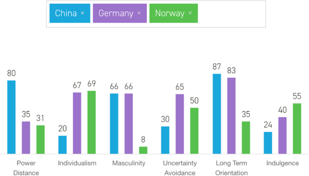
Figure 3: Hofstede’s cultural dimensions. Comparison of Norway, Germany, and China
Users from collectivist cultures such as China have a strong preference for visuals, whereas users from more individualistic cultures such as Germany prefer a logical and structured page layout. In a study that compared Canadian, U.S., German, and Japanese users, Japanese favored a more visual approach which could also appeal to user “emotion”. Based on the fact that Germany and Norway have very similar scores on both power distance and individualism as shown in figure 3, it was predicted that version A with it’s expanded data and logically structured data up-front would be preferred.
Results
Qualitative Results
Qualitative data, pertaining to the usability of the website, was collated through reviewing recordings of 10 users working with the interface over 2 days, and issues were identified using verbal protocol, heuristic, and quantitative review methods. Qualitative data obtained using verbal protocol analysis was analysed using thematic analysis (Scholar, 2017).
Thematic Analysis of email fulfilment approach (formative)

Figure 4: Word cloud of qualitative data from email research sessions
In the highlights excerpts analysed from the email interview transcripts the key words were identified, in order of their weight:
14 car 11 insurance 10 number 10 link 9 information 8 bring 7 website 7 VIN
6 something 6 referring 6 passport 6 first 6 back 5 graphic 5 image 5 maybe 5
think 5 just 5 good 5 it’s 5 need 5 one 5 top 4 flowchart 4 confused 4 address
4 rather 4 prefer 4 bottom 4 common 4 don’t 4 order 4 say 4 see 4 get 3 doc-
uments 3 wouldn’t 3 section 3 doesn’t 3 generic 3 webpage 3 others 3 online 3
Maybe 3 photo 3 phone 3 name 3 know 3 date 3 even 3 text 3 news 3 box 3
use 3 now 2 registration 2 Explanatory 2 possibility 2 dealership 2 processed 2
available 2 preferred 2 specific 2 possible 2 download 2 possibly 2 AutoPASS 2
Address 2 pointed 2 picture 2 ordered 2 already 2 licence 2 drivers 2 contact 2
useful 2 layout 2 colour 2 stated 2 looked 2 remind 2 really 2 better 2 emails
2 Norway 2 change 2 happy 2 thing 2 third 2 asked 2 click 2 weeks 2 page 2
stop 2 It’s 2 call 2 used 2 want 2 view 2 fact 2 GPS 2 e.g 2 TFS 2 buy 2 can 2 bit 1 something. . . takes 1 online’. . . ’some 1 dealer’. . . ’just 1 half-finished 1 monochromatic 1 specifically 1 Registration 1 accompanying 1 confirmation 1
participants 1 professional 1 appointment 1 explanation 1 superfluous 1 excep-
tional 1 improvement 1 repetitious 1 participant 1 Department 1 agreements 1
suggestion 1 responding 1 processing 1 requesting 1 collection 1 everything 1
preferably 1 impression 1 attachment 1 throughout 1 understand 1 accessible
1 real-time 1 telephone 1 important 1 searching 1 discussed 1 displayed 1 ini-
tially 1 barebones 1 following 1 Completed 1 situation 1 prominent 1 confusing
1 completed 1 companies 1 cards’. . . ’I 1 Referring 1 expecting 1 suggested 1
explained 1 happened 1 question 1 separate 1 sentence 1 repeated 1 probably
1 calendar 1 whatever 1 pictures 1 insurers 1 everyday 1 interact 1 accurate 1
password 1 function 1 part-way 1 Actually 1 continue 1 bankcard 1 explains
1 prefers 1 finance 1 thought 1 helpful 1 started 1 worried 1 version 1 figured
1 initial 1 objects 1 request 1 replied 1 instead 1 tickets 1 clarity 1 opening 1
relates 1 colours 1 related 1 explain 1 expects 1 minimum 1 telling 1 message 1
it’. . . ’in 1 stating 1 clearer 1 reality 1 example 1 appears 1 phoning 1 reading 1
without 1 usually 1 becomes 1 problem 1 dynamic 1 clicked 1 emailed 1 entered
1 Several 1 wasn’t 1 either 1 please 1 listed 1 needed 1 likely 1 texted 1 travel 1
centre 1 pickup 1 visual 1 boring 1 anyone 1 ranges 1 phrase 1 manner 1 status
1 phoned 1 person 1 mental 1 header 1 bought 1 static 1 expect 1 portal 1 flight
1 opened 1 bigger 1 button 1 Toyota 1 UNLESS 1 wanted 1 notice 1 routed
1 chosen 1 normal 1 system 1 ticket 1 BankID 1 didn’t 1 seemed 1 assume 1
though 1 here’s 1 dealer 1 access 1 taking 1 sooner 1 spaced 1 Status 1 items
1 begin 1 brand 1 needs 1 times 1 enter 1 carry 1 along 1 noted 1 using 1
liked 1 hours 1 chase 1 links 1 aware 1 local 1 right 1 check 1 Right 1 looks
1 opens 1 write 1 angle 1 gives 1 meant 1 seems 1 sense 1 going 1 wants 1
start 1 can’t 1 range 1 apart 1 model 1 touch 1 ready 1 guess 1 told 1 sold 1
says 1 17th 1 Chat 1 Even 1 real 1 push 1 part 1 paid 1 open 1 nice 1 will 1
talk 1 much 1 mind 1 term 1 make 1 look 1 less 1 14th 1 item 1 hurt 1 help
1 grey 1 Good 1 find 1 time 1 felt 1 side 1 face 1 else 1 well 1 Kind 1 demo 1
copy 1 chat 1 care 1 user 1 Lack 1 book 1 bank 1 area 1 also 1 able 1 0800 1
Vin 1 bus 1 way 1 two 1 I’m 1 Hmm 1 PDF 1 got 1 new 1 red 1 reg 1 saw 1 due.
These are also depicted graphically in the word cloud shown in figure 4. The key themes identified from this sample were:
Car (weight within sample: 14) – Participants expressed various views on the
positioning of the car image in emails. The consensus view was that the car would be best placed remaining at the top throughout the 4 emails.
Insurance (weight within sample: 11) – Participants offered feedback on the insurance section. Suggestions included links to insurance providers, modify- ing the colour of the insurance box to highlight it, and several participants indicated a preference for a clearer link between insurance and VIN number.
VIN (weight within sample: 7) – The majority of participants tested were un- clear of the purpose of the VIN number. They desired a clear explanation next to the VIN number detailing the fact that they could use it to arrange insurance.
Passport (weight within sample: 6) – The Norwegian participants were con- founded by the requirement for a passport and expressed consternation over this. They also requested a clarifying explanation for ID requirements under- lining the fact that not ALL ID was required but ANY photo ID was sufficient.
Quantitative Results
Data was analysed using both descriptive statistics and a traditional statistical model. Given the low sample size and heterogeneity of the data it was important to select the most appropriate tools. The data are presented in summary tables. Eye-tracking data was utilised to generate quantitative data for the studies.
System Usability Scale Results and Analysis
Despite being a self-described “quick and dirty” usability scale, the System Usability Scale (SUS), developed in the mid 1980s by John Brooke, has become a popular questionnaire for end-of-test subjective assessments of usability. The SUS accounted for 43 percent of post-test questionnaire usage in a recent study of a collection of unpublished usability studies. Research conducted on the SUS has shown that although it is fairly quick, it is probably not all that dirty (Sauro, 2016).
The SUS was demonstrably useful in this particular study due to its quick nature and accuracy of analysis. Figure 5 shows the question structure used in this study. It is a questionnaire with ten items, each with five scale steps. The odd-numbered items have a positive tone; whilst the tone of the even-numbered items is negative. Brooke (1996) states that participants should complete the SUS after having used the system under evaluation but before any debriefing. Participants are required to give their immediate response without over thinking the questions. The SUS method of scoring requires participants to provide an answer to all ten items. If they are not able to for some reason then they should select the centre point on the scale. In order to calculate a SUS score we first determine each items score contribution, which ranges from 0 to 4. For positively worded items (odd numbers) the score contribution is the scale position minus 1 (x – 1),
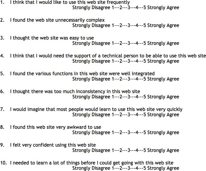
Figure 5: SUS questionnaire structure used in Norway study
whilst for negatively worded items (even numbers) the score contribution is 5 minus the scale position (5 – x). To find the overall score, we multiply the sum of the item score contributions by 2.5. therefore the overall SUS score ranges from 0 to 100 in 2.5 point increments. Figure 6 shows the mean SUS score calculated from the 10 questions which were answered using a 5-point Likert scale.
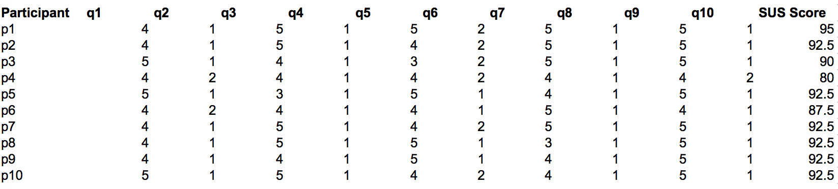
Figure 6: System Usability Scale Results for 10 participants
To calculate the SUS score the following method was undertaken: first sum the score contributions from each item. Each item’s score contribution will range from 0 to 4. For items 1,3,5,7,and 9 the score contribution is the scale position minus 1. For items 2,4,6,8 and 10, the contribution is 5 minus the scale position. Multiply the sum of the scores by 2.5 to obtain the overall value. The mean score from 10 users was 90.75 which equates to an A grade for the overall website experience. This is very high, the average score on the SUS is 68, a D grade.
Descriptive statistical Analysis of eye tracking data using defined areas of interest
Split-run test
Supporting the quantitative statistical data in the SUS questionnaire, eye- tracking data was used to generate descriptive statistics from defined areas of interests, testing the hypothesis predicting that version A would be preferred based on cultural factors. Specifically, the areas of interest which were defined were the expanded data on the purchase plan review page for version A and the collapsed accordion control section for version B.
Figure 7 shows the descriptive statistics generated for ’fixation count’ (i.e. number of distinct looks from one point to another) from the gaze plot data for version A (desktop) as well as the fixation count gaze plot data for version B (desktop). As can be seen in figure 8 which plots the mean values for each version, version A has a lower mean fixation count for all participants compared to version b which has a higher mean fixation count for all participants. This is in line with the hypotheses, as a higher fixation count indicates that the participant was repeatedly scanning the page trying to understand what they were looking at and attempting to find useful data on the page.

Figure 7: Descriptive statistics generated for ’fixation count’
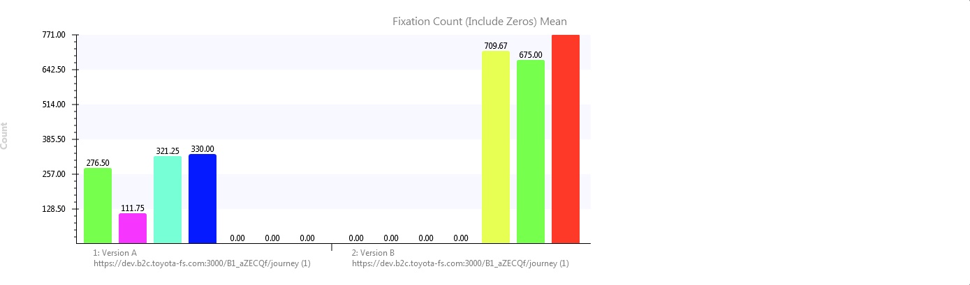
Figure 8: Plotting of descriptive statistics generated for ’fixation count’
A gaze plot image showing a time segment from version A (the culturally adapted version) can be seen in figure 9, and compared to a time segment gaze plot from version b (the non-adapted version) in figure 10. As can be seen there is much less saccadic activity in version A whilst saccadic activity is much higher in version B further strengthening the hypothesis. Figure 10 shows a gaze plot time segment for the mobile version where a similar pattern can be seen.
Figure 9: Gaze plot time segment for participant 1 — Version A
Figure 10: Gaze plot time segment for participant 2 — Version B
Heat map and opacity map analysis of homepage header image
During the design process there was much discussion around the efficacy of the header image, featuring the user’s chosen car against a country-specific background, resulting in a number of variants being developed. In order to test the prominence and effectiveness of this header image a cumulative heat map and cumulative opacity map were used. A heat map (or heatmap) is a graphical representation of data where the individual values contained in a matrix are represented as colors. The term ’heat map’ was originally coined and trade- marked by software designer Cormac Kinney in 1991, to describe a 2D display depicting financial market information, though similar plots such as shading matrices have existed for over a century. A gaze opacity map, converesely, has the same goals that a classic heatmap has but it offers more detailed and clear results. It is often considered as the reverse of a heat map because only areas that got attention are shown and other areas are masked or blacked out. On a classic eye tracking heatmap, it is the opposite, attention areas are masked by hot colors and ignored areas are clearly observable. A design hypothesis was put forth early on that separating the car from the background image would make it clearer that this was the end user’s chosen car and not a stock image. Interestingly, however, the image was not viewed at all by any of the participants.
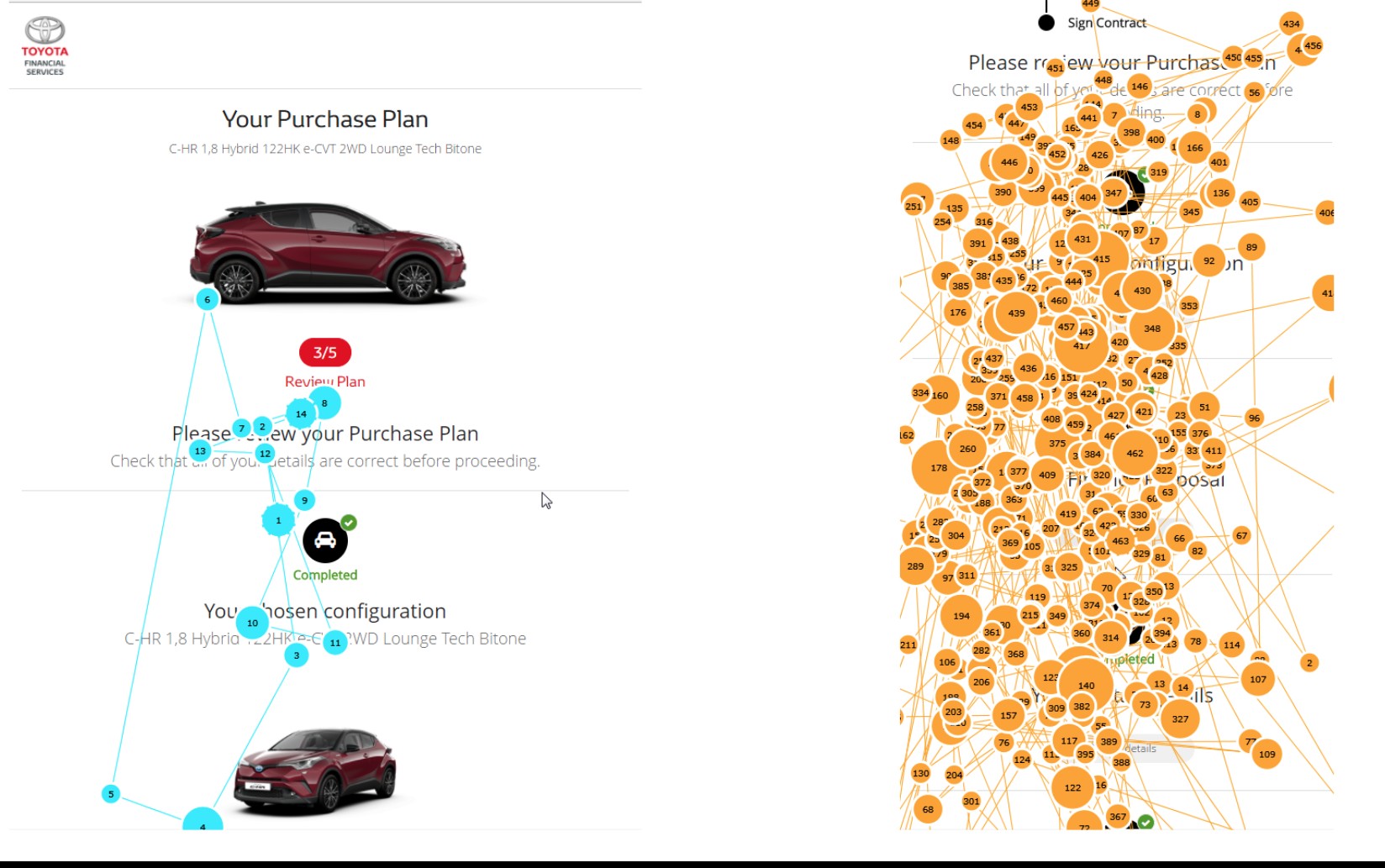
Figure 11: Gaze plot time segment for mobile — Version A (culturally adapted) and B (non-adapted)
The theory I put forth to explain this is the user’s task-focus at this stage, as the user has already configured their car they are now concerned with checking the facts regarding their potential finance package and so gaze straight over the image to fix on the important finance data. There is a cultural element at play here too, as Norwegian users are concerned with consuming technical data and facts within a page, there may be different behaviour within a culture such as China where aesthetic elements are far more important.
Discussion and recommendations
Website
Users had no issue navigating both versions of the site, though , as hypothesised, version A reduced the number of fixations and subsequent cognitive load on the user as identified through split-run testing. The website journey tested very well scoring over 90 on the SUS (an A grade) with supporting qualitative feedback and eye-tracking data indicating this website experience had reached a stage, through previous research and iteration, whereby it did not need further amendments to offer an acceptable user experience.
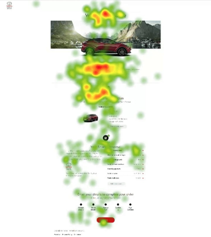
Figure 12: Cumulative heat map for homepage
Figure 13: Cumulative opacity map for homepage
Though journey A was the most effective for Norwegian users it is recom- mended that countries that are culturally distinct to Norway (as can be identi- fied using Hofstede’s cultural dimensions) have their own experiences designed taking into account cultural factors. For example, it is believed that journey B would test more effectively in China than it did in Norway and that more attention would be paid to the header image. Localising for different countries should take into account design elements rather than just language in isolation.
Emails
Recommendations are derived from the thematic analysis in section 9.1.1 and re- produced here along with recommndations derived:
Car (weight within sample: 14) – Participants expressed various views on the positioning of the car image in emails. The consensus view was that the car would be best placed remaining at the top throughout the 4 emails.
Insurance (weight within sample: 11) – Participants offered feedback on the insurance section. Suggestions included links to insurance providers, modify- ing the colour of the insurance box to highlight it, and several participants indicated a preference for a clearer link between insurance and VIN number.
VIN (weight within sample: 7) – The majority of participants tested were un- clear of the purpose of the VIN number. They desired a clear explanation next to the VIN number detailing the fact that they could use it to arrange insurance.
Passport (weight within sample: 6) – The Norwegian participants were con- founded by the requirement for a passport and expressed consternation over this. They also requested a clarifying explanation for ID requirements underlin- ing the fact that not ALL ID was required but ANY photo ID was sufficient.
This was the first time the email fulfilment journey had been shown to users and as a formative piece of research extensive comments and feedback were to be ex- pected. The changes requested are primarily reconfiguration and repositioning of elements and do not require extensive work.
References
Reinecke, Katharina, and Abraham Bernstein. ”Improving performance, per- ceived usability, and aesthetics with culturally adaptive user interfaces.” ACM Transactions on Computer-Human Interaction (TOCHI) 18.2 (2011): 8.
Marcus, Aaron, and Emilie West Gould. ”Crosscurrents: cultural dimensions and global Web user-interface design.” interactions 7.4 (2000): 32-46.
Cyr, Dianne. ”Modeling web site design across cultures: relationships to trust, satisfaction, and e-loyalty.” Journal of Management Information Systems 24.4 (2008): 47-72.
Hofstede, Geert. ”Dimensionalizing cultures: The Hofstede model in context.” Online readings in psychology and culture 2.1 (2011): 8.
Moore, J. P., Younger, R., Abdelnour-Nocera, J., Rosunally, Y. Z., Kheirkhahzadeh,
A. D., Bagale, J. N. (2015, April). A sustainable information kiosk driven by sound. In Sustainable Internet and ICT for Sustainability (SustainIT), 2015 (pp. 1-2). IEEE.